Timeline
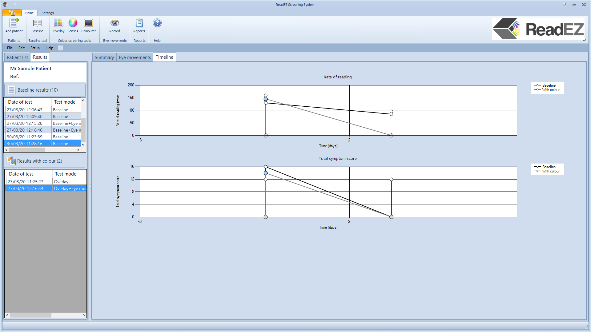
Selecting the Timeline tab display a timeline for the Rate of Reading and Symptoms. This allows the practitioner to assess how reading performance and symptoms have changed over a period of time. Each graph shows the Baseline results (empty circles and black line) and results with the optimum colour (circle showing preferred colour and grey line).
The first graph shows Reading Speed (words/minute) as a function of time.
The second graph shows the Total symptom score (the sum of the severity grade for all four symptoms) as a function of time.